Monday, September 29, 2008
Outback Australia--Some picture we took today
Sunday, September 28, 2008
Saturday, September 27, 2008
Scrapbooking Styles
We had discussion about the styles recently in our forum. Some of us know our styles while some of us are still experimenting. But, we all do know that there are a few styles available. I think they are not separate entity. The styles can overlap or mix, depending upon what is the theme of the layout or our frame of mind at that time of making the layout. Sometimes you can clearly say this layout belongs to a particular category. Some times we cannot classify. I think it is like Beauty, lies in the eye of the beholder.
Again, no two people scrap page are the same nor no two-scrap pages turn out to be the same. Why? Because we all have personal styles. Our personal style can change as we learn new techniques and use new or different embellishments and papers.
Talking of styles here are a few styles widely talked about in scrap booking articles
- Traditional/Classic: These are usually clean, crisp, symmetric, formal and simple. Use solid colours, photos are in either rectangle or square shapes, not many embellishments are used or minimum embellishments. The photo and journaling stand out. These layouts are generally timeless, elegant and sophisticated. Minimalist approach comes in this category.
- Contemporary /Modern: These have hard spare lines, clean, geometric shapes, asymmetrical, and contrasting colours, bold patterns, few strong accents or embellishments
- Romantic: Use pastels, floral patterns and layers of pattern paper. Soft looking layouts. Generally vintage and shabby chic are classified into this category. Fonts and journaling are ornate or handwritten. Techniques like chalking and inking are used often and most embellishments look like they have come from grandma’s sewing basket—buttons, brads, fibres, and ribbons…
- Ephemera/Whimsical/playful charm: use contemporary colours with muted or bright tones. Plenty of 3D elements, bold and mixed font titles and journaling, plenty of stipes, dots, circles, shapes, metal embellishments. Elements are placed at an angle or they overlap with each other but not messy. Collage comes under this style. There is plenty of details and texture in this layout.
- Conservative/Naturalist: Use heaps of earthy tones, texture, and monochromatic colours. So often you find paper tear, sanded edges, handmade papers or any elements from the nature.
And then there is this artistic and eclectic approach which most of us do and we call it experimental!
Now one of the article talked about, the level of complexity to each layout. Which can be quick, intermediate and complex.
Quick is simple smooth edges and a title
Intermediate is setting things in a slant and extra more embellishments
Complex is adding layers, journal ling block, adding more texture or finishing off with extra embellishments the coordinate you theme.
I think this is where our individuality comes in and each and every layout starts to look unique to the person who made it.
Hope this little piece I complied is useful to you all.
References:
- www.scrapjazz.com, What my style? By Jane Swansm, May 12 2005
- www.scrapbooking101.net, Finding a scrap booking style, by LeNae Gerig, October 2005
- www.ezine@rticles.com, Spectacular Scrapbook Styles, by Marcey Larsen, December 2006.
- www.scrapbookingmaterials.net, Scrap booking Style: What is yours?
- www.scrapbook.com, Finding your style, by Jill Davis.
Cyber crop Weekend
Uproar2scrapmore is having cybercrop now. The theme is RETRO.
I can hear you all Noooo Nooooo. I was like "I hate those color combinations". I was not very thrilled about it but I always love challenges. I also do not have many black and white photos from 10 years ago. Everyting is with my parents at home!!! Anyway, after a short convincing chat with Dalena from Uproar, I decided to participate.The fun part is the games, chat and also the specials Dee puts up during cybercrop.
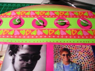
The first challenge was an OTP (for those of you who are wondering, "what an OTP is"?.... It is Off The Page). Use vinyl LP, green and pink colors, lots of layering using embellishments, Pps and finally the word RETRO in the title!!
I had so much fun on this one. I used Elton John's 1960s photos on it. Lots of bright green and pink and bling (specially for Elton!!!lol!!). I loved it. Here it is for you
Now off to do a layout. this is going to be tough because I have to have an original B/W photo from 30 years ago. I am going hunting........... Will catch you later.
Friday, September 26, 2008
Here are the pictures of my layouts
Yesterday!!
I was feeling bad for doing that . Therefore I created a layout with her picture. Will upload soon. The layout was part of Chris W's challenge in debscreations.net.au Rules are to use circles or squares or any shape with a diameter of not more than an inch! Seemed difficult initially. So made a card first but then I stuck with an idea yesterday looking at Tinky the parrot's photo and instantly started making one.
I also made another layout from a sketch on stucksketches. I just loved the basic Grey's Urban Couture collection. Wish I had some more of it.
What else did I do yesterday. Aaaa I spent some money shopping in salvation army preparing for this weekend's Uproar2scrapmore cyber crop challenge. Bought a Vinyl LP and then found some crochet stuff and lace too. So picked them up. You know there will always be some extra stuff to buy other than what we intend to buy!!!!!!!!!
On the way back I saw some very nice blue thread work on white tops in Kmart. I will probably buy some today. I love the white tops, just goes with anything. Kmart stuff is not too good but ok to wear for one season summer. I do not mind. Will have a look in other shops as well. Problem is everything in every shop looks nice.
My SIL bought me a very nice pale pink parsley design dress in US. I have to buy a bolero for it. I am on a lookout for a good pale pink or white bolero... Do not know when and where I will get it.
Got to go now. Will load some more pictures tonight. Time for lunch!!!
Wednesday, September 24, 2008
4 of us--Layout
Hurray!! off I go with making the layout. Printed off some sepia photos from my desktop. I usually make my layouts within 2 hours and this one took me less than 2 hours. Everything just fell in place.It was like a miracle. I like the metal frame. It just pops and add interest in the layout. Anyway, I thought I will put it up with some closeup photos.
Work was relaxed and I am feeling so sleepy already. Pizza for Dinner then..
Will catch you guys tomorrow. Off to buy Pizza
Bye for now
Tuesday, September 23, 2008
Stained Glass like embellishment--Step to Step Instruction
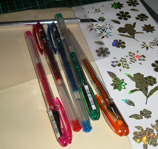
1. 3D outline stickers. You will get in the card making section in your LSS
2. Acetate paper or transparency sheet
3. Colour gel pens- sparkle ones even better for butterfly
4. Craft knife.
Making it:
1. Remove one of the outline sticker carefully ( I have used flower to show you, there is butterfly which is more effective) and paste it on the transparency sheet.
Here are photos of the butterfly I made.
Today's tip
Pick and choose a few photos to make a couple of layout or a double layout. Make a slideshow DVD or CD of the rest of the photos and pop the disc into a pouch on one of the layout or behind one of the layout. That way you have the layout of the event and more picture on the disc together. Sounds good?
Whats for today?
So, I am one of the Guest Member for January 2009. Can't wait to start on her very interesting projects.
Thanks Tanyah for giving me the opportunity. Will put in my best effort.
Step by Step instruction:
Today, I completed the step by step instruction class. I will put it up soon. This will be my first and I would like some feedback on it.
Chris W from challenge chic has started a wonderful blog place
www.born2create.ning.com It is amazing and very user friendly too.I love it especially the color combo Chris has used using one of her layout. OOOooo fabulous.
My day has been good so far. Will update the step by step instruction soon. Can't wait!!!!
Monday, September 22, 2008
Spongebob Squarepants..... They are my kids fav..
I hate sponge bob square pants series but my kids just love him. My DS watches and watches and cannot stop talking about it. When we went to Lego land, California, we saw this Sponge bob made out of Lego bricks. My kids were only too happy to pose for a photograph. My DS then goes OHHHH I love him!!!!!!!
Today, I had some time to make a layout for uproar2scrapmore's monthly challenge. Rule is to use 3 Kaiser products. That was not very hard is it?
I love Kaiser products and sometime I just keep them without using them. Anyway, I wanted to use this extreme range PP and also loved Ingrid G's idea of a lace tie on one of her layout.
Oh yeah, her layouts are very impressive. She is my fav. scrapper. Anyway, I combined both this idea and the challenge to create a layout. Here it is for you.
The three kaiser products used here are the extreme PP, the rhinestones and the pearls.
Yaaawn!!!! Yaaawn!!!!. I am tired today. The parrot kept me very busy. Quick dinner and off for today.
Another Wooo... Hooo....
Wooo Hoo... thats exciting for me.Just motivates me to learn more and attempt new stuff. Thanks Dee.
Wooo Hoooo
Wooo... Hoo.... I am all excited because this is my first. October is coming up soon and I just can't wait. I would like to contribute as much as I can and also learn as much as I can. Learning is a continous process I think. Never stops at any stage in life.
I should thank Dalena and Lisa and the other Tiger Team members at uproar for it.
Special thanks to Deb Mitchell of debscreations.net.au without which I just could not have achieved as much as I have achieved today.
Sunday, September 21, 2008
A tip
Today's layout--Cheeky Devil
But today I had to take out my brush and paint because it was the rule of one the challenges. I had to do you see.
I am a lazy bum I know I know .........
So I decided what the............ ...............and picked up the brush and paint and painted. Then made a layout. Here it is for you to see.
Some of my new layouts I did yesterday
For the first one, I pulled out my sewing machine and used it. Wow!!!!..... that felt GOOD. I also made a shabby chic layout for the first time.
Bye for now...
Enjoy the rest of the day.
Tinky the parrot
collect crockery!!
My first ever post and blog
Phewww!!, I got through the initial hesitation of starting a blog. Should thank all the ladies at challenge chic who own a blog site for it. Going through their blogs inspired me. So here I go.
Well, today my day has not yet started. But I have a few on my agenda. Clean up my shed and organize the tools. Hubby has bought some steel shelves and getting them set up. Then I have to wipe all my glass doors and windows. My son will give a hand on that. Then cook a proper meal.Maybe something special and easy today.
I have to do a couple of layouts today. By afternoon I have get that started. I will post my pages here with some close up photos as well.
Let me get going.