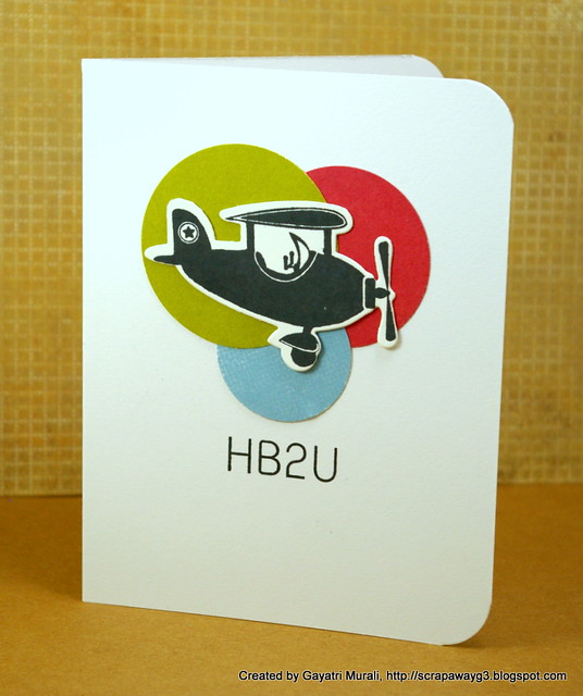
In my previous post I said I am reading a book about how to design cool stuff. So in the book one of the basics is about colours. I wanted to try the colour wheel and make a card. In this card I have tried to use Split Complement colour scheme. Here is the pictorial despcription of split complement colour scheme.
Here is how I used the scheme on my card in a clean and simple way.

Lots of white space, focal image above the eye level and because the focal image is bright and catches the eye, the senitment is short and simple.
Thanks for visiting!

Lots of white space, focal image above the eye level and because the focal image is bright and catches the eye, the senitment is short and simple.
Supplies:
Cardstock: Stampser's Select White cardstock from Papertrey Ink
Pattern Paper: from my stash
Stamp sets: Boy Basics Game on and Fly away from Papertrey Ink
Ink: Stazon Black Ink
Accessories: Three different sizes of circle punches and Corner Chomper.
Thanks for visiting!


6 comments:
This is CAS goodness at its best.
Awesome card - love the color scheme! Will you share the title of the book with us?
How big was this bag of crafty goods you took away with you?? lol!! Another great card. You are really getting in some good crafty time whilst you are away with the family. xx
Love it! Perfect CAS card.
Fabulous CAS card! Maybe I need to get a hold of that book. :)
Excellent, so CAS.
Post a Comment